Flora und Flora | Sunny 16 #2 (Set 2/6)

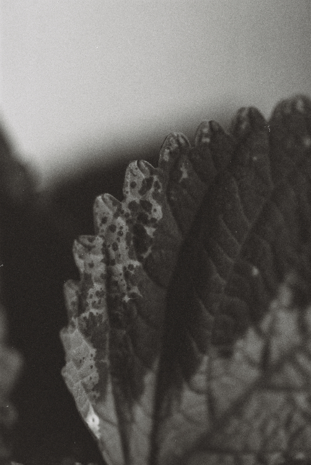
Pflanzen sind ein wunderbares Motiv und dazu auch ein sehr angenehmes, weil sehr geduldig (hehe). Hier verstecken sich die zwei ersten Fotos, die mit meinem neuen Makro-Objektiv geschossen wurden. Findest du sie?

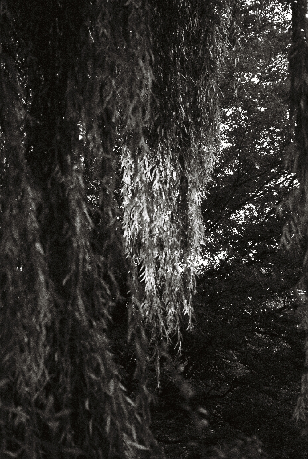
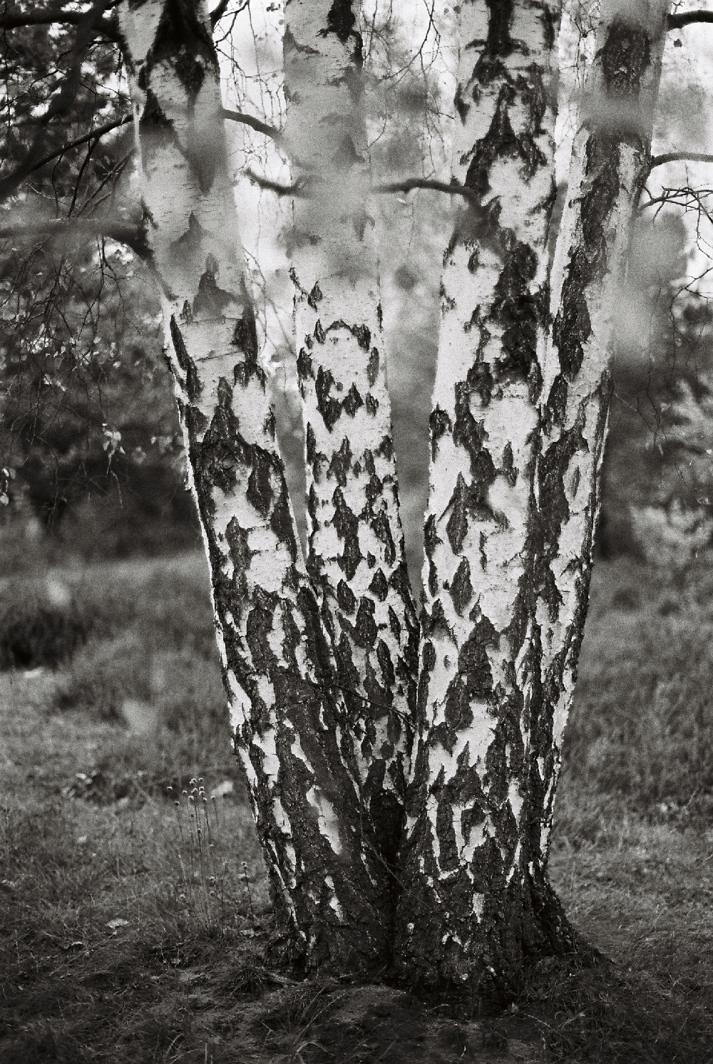
An der Trauerweide vorm Haus komme ich einfach nicht vorbei ohne ein Foto zu schießen. Leider ist das Bild unscharf, daher wirkt es wirr. Birken sind ein dankbares Motiv für Schwarzweißfotos, weil sie diesen schönen Kontrast haben zwischen weiß und braun im Stamm. Ich hatte damals versucht, die Blätter an den Ästen als Vordergrund zu nutzen, aber denke, dass sie einen Tick zu unscharf geworden sind. Und jetzt sehe ich erst die kleinen Blümchen links neben dem Stamm. Die sind ja süß!

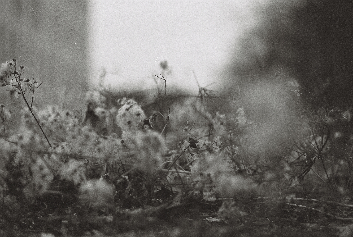
Das Gestrüpp. Auch wenn hier wenig Kontrast ist und alles eher breiig grau wirkt, ich mag es. Ich mag’s wie sich die Ebenen zeigen und in der Mitte tatsächlich dieses vertrocknete Blatt scharf ist (War das Glück oder Können?). Mit diesem Bild werde ich sicherlich noch bisschen rumspielen und sehen, was in der Bildbearbeitung noch zu machen ist.

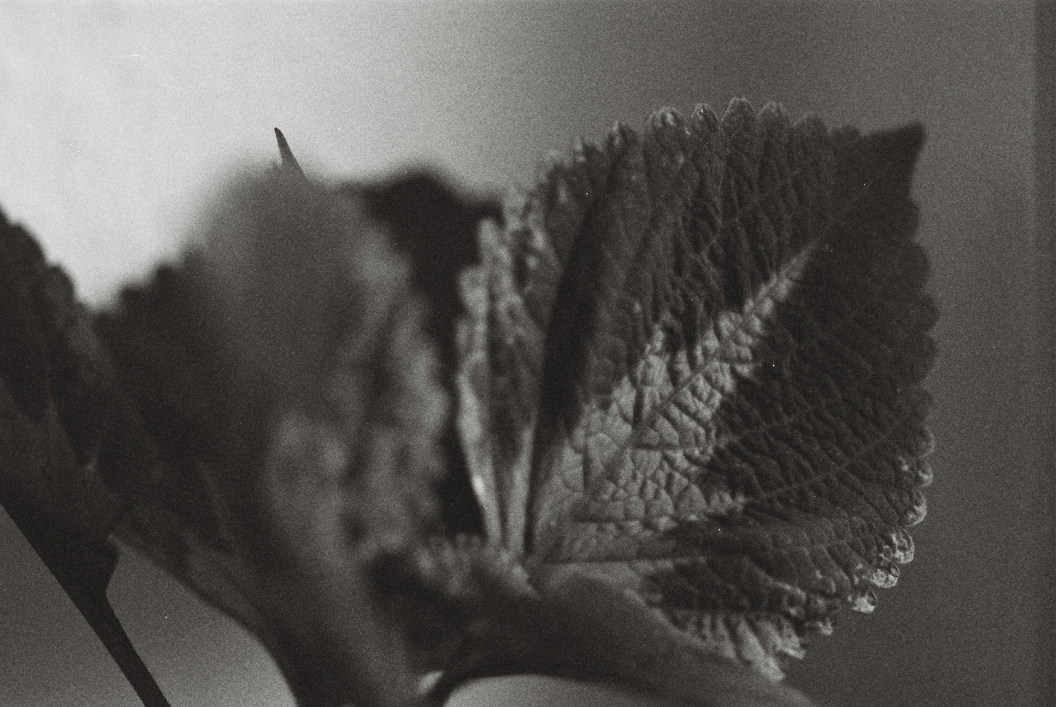
Stimmst du mir zu, dass die farbliche Musterung und die Adern auf dem Coleus (Buntnessel)-Blatt faszinierend sind?

Hard facts! Camera: Minolta Dynax 9000 AF, Minolta AF 50 mm f/1.4 and Minolta AF Macro 100 mm f/2.8 | Film: Kodak T-MAX 400 | Development & Scan: Fotolabor Görner Dresden

go to english version

Inside and outside, buildings | Sunny 16 #2 (Set 1/6)

Although I’m not sure what it was that I wanted to express with the photos of the windows and whether it should like how it looks now on the pictures (up to 50 % being completely black), I think they convey a certain atmosphere. Especially the one where the handle is in the middle of the picture is nice to me. The contrast catches me.

A few months ago a friend who just entered the world of analogue photography, and I went on a small photography tour. Typography fascinates me and that’s how „Allerlei am Markt“ („Potpourri at the marketplace“) got on my film. Unfortunately the words are not in focus (I’m on my way to fix the root cause) and I am not completely content how I captured the words. 66c doesn’t have a particular meaning to me. It was typography as well which made me shooting this.

And last but not least: Görgesbau. Every building on the campus of TU Dresden has its own name, ending with -bau (building) and actually I had the idea to photograph all buildings, or the their names to be more precise. But so far, this remained an idea only.

Görgesbau was a photographical surprise to me! It was dawning already and I was afraid that it could be too dark already to shoot a proper photo. Nonetheless, I gave it a try – I had a film with ISO 400 in my camera and thought this is not the worst condition to shoot at dawn. When I saw the result, I clapped myself on the back for estimating the light kind of correct. And I don’t have to mention the typography, do I?

Is there a photo which touches you in any way?

Hard facts! Camera: Minolta 9000 AF, Minolta AF 50 mm f/1.4 and Minolta AF Macro 100 mm f/2.8 | Film: Kodak T-MAX 400 | Development & Scan: Fotolabor Görner Dresden